Showing posts with label Planning. Show all posts
Showing posts with label Planning. Show all posts
Tuesday, 29 January 2013
Masthead final design
i decide to put my masthead all together. i tried different ways of trying the crown. i got my peers to asses which ones they like the best. they all opted for the 3rd design for the crown leaning to the side. therefore im going to go with this masthead.
Wednesday, 23 January 2013
Crown
i traced and scanned the crown onto the computer and then opened it in photoshop. i then used the outline and filled in the middle with black to make a silhouette.
Tuesday, 22 January 2013
MQ colours
i decided to change the colours of the MQ to test it, i decided to two different colours and over lap them to make something a bit more interesting
MQ Colours
so i took the MQ to photoshop to edit, i thought that it would look to use these colours and it fits into the aztec design, however the image was to pixelated for me to work with so it did not come out as well as i would of liked it to. so i decided not to do that design.
MQ fonts
i decided on the name that i wanted, i settled for MQ. i tried a bunch of fonts and decided that i liked the last MQ font with the crown. i then took this idea to photoshop to edit it.
Wednesday, 16 January 2013
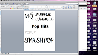
Mastheads - Music Mag
These are my mastheads for my music magazine. i really like the first one MQ with the crown. i would most probably use that as my masthead and use the tablets we have in school to get the crown on the top. Mubble Jummble is to long for a magazine name. Pop Hits is to simple and wouldnt attract many people. Pop Up isnt bold enough. i dont really like the style on it. Smash Pop is okay, it is a bit to long and not really a pop magazine kind of style.
Colour Schemes - Music Mag
This is my colour scheme. my first colour scheme consists on 5 colours. I have black in all of them because its a nice colour to have around but not too much of it. i don't like the 2 greens in the first row so i wouldn't use this colour scheme. the second one i have done a sort of blue colour scheme with a yellow and a black. i wouldn't use this however because it is too much blue. Stuff that i want to stand out wont because of the blue. The third colour scheme i like because there is a range of different colours and i could use this as my house style. The fourth colour scheme i like as there is all different colours that i could use. i would also use this as a house style. the last colour scheme i like, however it is too much pink and like i said before the things i would like to stand out wouldn't because there is too much pink.
Tuesday, 15 January 2013
Music Magazine Flat Plans - Front covers
These are my first two detailed flat plans for my music magazine.
i made sure that i included i the Masthead, a Flash, Sell Line, Pull Quote, Pricing information.
The Name of my magazine is going to be MQ, standing for Music Queen. On the first one i made sure that i put a lot of information in the left third.
i made sure that i included i the Masthead, a Flash, Sell Line, Pull Quote, Pricing information.
The Name of my magazine is going to be MQ, standing for Music Queen. On the first one i made sure that i put a lot of information in the left third.
Subscribe to:
Posts (Atom)


