Tuesday, 22 January 2013
MQ Colours
so i took the MQ to photoshop to edit, i thought that it would look to use these colours and it fits into the aztec design, however the image was to pixelated for me to work with so it did not come out as well as i would of liked it to. so i decided not to do that design.
MQ fonts
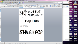
i decided on the name that i wanted, i settled for MQ. i tried a bunch of fonts and decided that i liked the last MQ font with the crown. i then took this idea to photoshop to edit it.
Sunday, 20 January 2013
Thursday, 17 January 2013
Music magazine - Top of the Pops & Smash Hits

The front cover of Top of the pops is pretty over loaded. They pack everything into the front cover trying to get as much attention as possible. The cover acts like a contents as well as a front cover. It tells you everything that is in the magazine. They have cute little flashes everywhere of the most famous people in pop which will draw in their young audience. I would say that their target market for this magazine would be from the age of 8-13 as the things included in the magazine would be most relevant to those age groups. The colour scheme of Top the Pops have a range of different colours but not to many so that it looks a mess. They have Red, Black, Yellow, Pink and White. The main colour of the magazine is the light pink and then they have a splash of Yellow, black and red around the front cover. The fonts they have used are very big a bold and the writing seems to be in capitals a lot. They don't use complicated fonts as they want their audience to be able to read the words like 'Secret' instantly.
In comparison to Smash Hits, it is similar in some ways to TOTPs. Once again the cover is over loaded with things to attract their young audience. I would say they attract the same age group as TOTPs do. Their main colour scheme is Pink, Yellow, Blue and Black. Yellow being their main colour. They also have the American flag in the background adding more colour to the magazine.
Both magazine seem to have the same kind of outline. They both have very similar features. So therefore making a pop magazine that is what the magazine should typically look like.
Wednesday, 16 January 2013
Mastheads - Music Mag
These are my mastheads for my music magazine. i really like the first one MQ with the crown. i would most probably use that as my masthead and use the tablets we have in school to get the crown on the top. Mubble Jummble is to long for a magazine name. Pop Hits is to simple and wouldnt attract many people. Pop Up isnt bold enough. i dont really like the style on it. Smash Pop is okay, it is a bit to long and not really a pop magazine kind of style.
Colour Schemes - Music Mag
This is my colour scheme. my first colour scheme consists on 5 colours. I have black in all of them because its a nice colour to have around but not too much of it. i don't like the 2 greens in the first row so i wouldn't use this colour scheme. the second one i have done a sort of blue colour scheme with a yellow and a black. i wouldn't use this however because it is too much blue. Stuff that i want to stand out wont because of the blue. The third colour scheme i like because there is a range of different colours and i could use this as my house style. The fourth colour scheme i like as there is all different colours that i could use. i would also use this as a house style. the last colour scheme i like, however it is too much pink and like i said before the things i would like to stand out wouldn't because there is too much pink.
Tuesday, 15 January 2013
Music Magazine Flat Plans - Front covers
These are my first two detailed flat plans for my music magazine.
i made sure that i included i the Masthead, a Flash, Sell Line, Pull Quote, Pricing information.
The Name of my magazine is going to be MQ, standing for Music Queen. On the first one i made sure that i put a lot of information in the left third.
i made sure that i included i the Masthead, a Flash, Sell Line, Pull Quote, Pricing information.
The Name of my magazine is going to be MQ, standing for Music Queen. On the first one i made sure that i put a lot of information in the left third.
Subscribe to:
Posts (Atom)


