
Wednesday, 1 May 2013
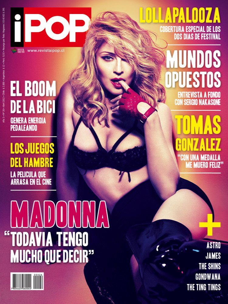
Magazine Front Cover
Double page spread

Music Mag Contents

Friday, 26 April 2013
How did you attract/address your audience?

I addressed my audience firstly by getting people to take a survey answering questions about what they like. I then went on to calculate my results and came up with my answers. A lot of the girls said they liked pink and purple so i tried to incorporate this as much as possible on the front cover to attract them in. My survey also showed that girls like boy bands and so I created my own, calling them the new one direction. This will also attract my audience as they are young girls who love boys and also love one direction. I used the conventions of a typical magazine like glamour. I also used bright colours and pictures that look directly at my audience to pull them in.
What kind of media institution would distribute your media product why?
A company like IPC or Bauer media as they are both very big companies. Bauer media distribute magazines and music channels and IPC distribute a wide range of magazines. IPC is an outstanding company which distributes many big magazines of all genres. However, if I had to choose one company I would choose Bauer media as they produce a lot of music magazines and they also have a line of music channels. So they have a wide knowledge of music and could help advertise and promote my magazine in the right way.
Furthermore, IPC are an amazing company that are specifically for producing magazine, they also have all different types of genres of magazines. Unlike Bauer. Bauer have a good knowledge of music, however, not a great knowledge of producing music magazines. Either company that I would chose to produce my magazine would do a good job. However, now that I have looked over both companies I would choose IPC as they do not have a Pop magazine like mine so they wouldn’t have to compete with their own type of magazine.
How does your media product represent particular social groups?
My magazine represents my particular social group because the group that I chose is young girls between the ages of 15 to 25. This allows me to use very girly colours such as pink and purple. The social group that I want to mainly attract is a very girly kind of girl. The type of girl that would listen to boy bands and girls like Miley Cyrus. They would be young, predominantly white typically in full time education. They don’t have much money to spend spare but they have enough a month to buy my magazine. The girl would typically spend time with her friends and socialize with other music fans.

Wednesday, 20 March 2013
Ryans Gosling Images
I got this image from google images. The website is www.digitalspy.co.uk. i decided to use a found image because i wanted to have an image of someone who was
extremely good looking and had a good body. so i thought it would be appropriate to get someone
famous off of the internet.

extremely good looking and had a good body. so i thought it would be appropriate to get someone
famous off of the internet.

Wednesday, 30 January 2013
Front cover Progresion
The first front cover i came up with didn't feel right so i decided that i should change the background image. so i then found the image on the second front cover and decided that looked a lot more professional. i am yet you add in a poster in the blank space. i am putting together a boy band so pictures will be on soon.

BEFORE
AFTER
BEFORE
AFTER
Tuesday, 29 January 2013
Masthead final design

Wednesday, 23 January 2013
Crown


Tuesday, 22 January 2013
MQ colours

MQ Colours

MQ fonts

Sunday, 20 January 2013

Thursday, 17 January 2013
Music magazine - Top of the Pops & Smash Hits
 Top of the Pops and Smash Hits
The front cover of Top of the pops is pretty over loaded. They pack everything into the front cover trying to get as much attention as possible. The cover acts like a contents as well as a front cover. It tells you everything that is in the magazine. They have cute little flashes everywhere of the most famous people in pop which will draw in their young audience. I would say that their target market for this magazine would be from the age of 8-13 as the things included in the magazine would be most relevant to those age groups. The colour scheme of Top the Pops have a range of different colours but not to many so that it looks a mess. They have Red, Black, Yellow, Pink and White. The main colour of the magazine is the light pink and then they have a splash of Yellow, black and red around the front cover. The fonts they have used are very big a bold and the writing seems to be in capitals a lot. They don't use complicated fonts as they want their audience to be able to read the words like 'Secret' instantly.
In comparison to Smash Hits, it is similar in some ways to TOTPs. Once again the cover is over loaded with things to attract their young audience. I would say they attract the same age group as TOTPs do. Their main colour scheme is Pink, Yellow, Blue and Black. Yellow being their main colour. They also have the American flag in the background adding more colour to the magazine.
Both magazine seem to have the same kind of outline. They both have very similar features. So therefore making a pop magazine that is what the magazine should typically look like.
Wednesday, 16 January 2013
Mastheads - Music Mag

Colour Schemes - Music Mag

Tuesday, 15 January 2013
Music Magazine Flat Plans - Front covers

i made sure that i included i the Masthead, a Flash, Sell Line, Pull Quote, Pricing information.
The Name of my magazine is going to be MQ, standing for Music Queen. On the first one i made sure that i put a lot of information in the left third.
Subscribe to:
Comments (Atom)